8 Graphing: One Variable at a Time
One Categorical Variable
Please watch the Chapter 08 Video below.
Consider the data frame EPIDURALF from the PASWR2 package which records intermediate results from a study to determine whether the traditional sitting position or the hamstring stretch position is superior for administering epidural anesthesia to pregnant women in labor as measured by the number of obstructive (needle to bone) contacts. In this study, there were four physicians. To summarize the number of patients treated by each physician we can use the function xtabs.
library(PASWR2)
xtabs(~doctor, data = EPIDURALF)
doctor
A B C D
61 115 93 73 A barplot of the number of patients treated by each physician (doctor) using ggplot2 is constructed below.
library(ggplot2)
ggplot(data = EPIDURALF, aes(x = doctor)) +
  geom_bar(fill = "lightblue") +
  theme_bw()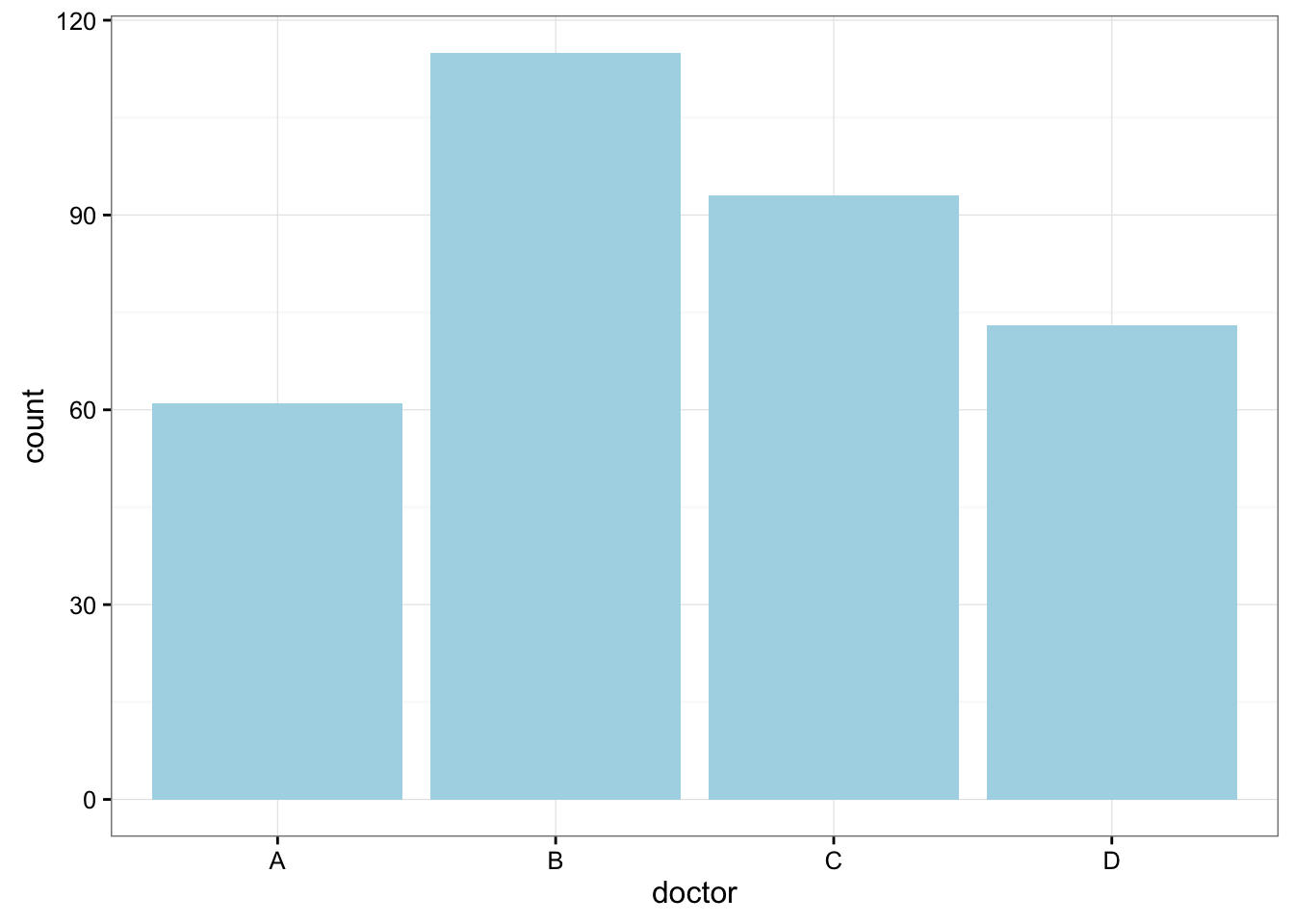
Here is some information that would be interesting to get from these data:
What percentage of the patients were treated by each physician?
prop.table(xtabs(~doctor, data = EPIDURALF))doctor
A B C D
0.1783626 0.3362573 0.2719298 0.2134503 How are patients divided across physicians? Are they equally divided? If not, do the percentages follow some other kind of pattern?
One Quantitative Variable
We have explored the distribution of a categorical variable using a bar chart supplemented by numerical measures (percent of observations in each category). In this section, we will learn how to display the distribution of a quantitative variable.
To display data from one quantitative variable graphically, we typically use the histogram.
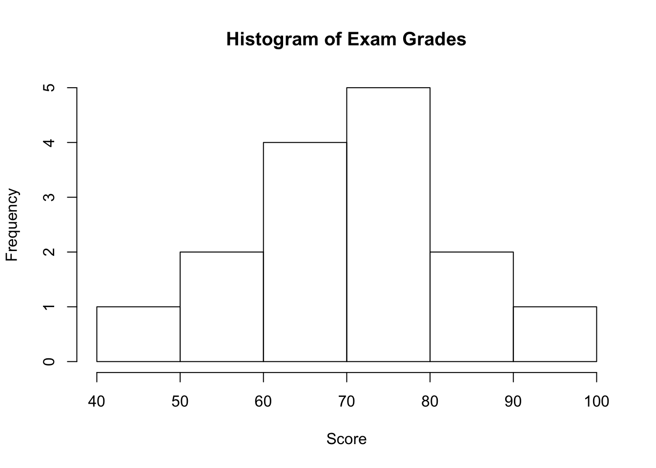
Example5
Break the following range of values into intervals and count how many observations fall into each interval.
Exam Grades
Here are the exam grades of 15 students: 88, 48, 60, 51, 57, 85, 69, 75, 97, 72, 71, 79, 65, 63, 73
We first need to break the range of values into intervals (also called “bins” or “classes”). In this case, since our dataset consists of exam scores, it will make sense to choose intervals that typically correspond to the range of a letter grade, 10 points wide: 40-50, 50-60, … 90-100. By counting how many of the 15 observations fall in each of the intervals, we get the following table:
| SCORE | COUNT |
|---|---|
| [40,50) | 1 |
| [50,60) | 2 |
| [60,70) | 4 |
| [70,80) | 5 |
| [80,90) | 2 |
| [90,100) | 1 |
To construct the histogram from this table we plot the intervals on the \(X\)-axis, and show the number of observations in each interval (frequency of the interval) on the \(Y\)-axis, which is represented by the height of a rectangle located above the interval:
Interpreting the Histogram
Once the distribution has been displayed graphically, we can describe the overall pattern of the distribution and mention any striking deviations from that pattern. More specifically, we should consider the following features of the distribution:
- Shape
- Center
- Spread
- Outliers
We will get a sense of the overall pattern of the data from the histogram’s center, spread, and shape, while outliers will highlight deviations from that pattern.
Shape
When describing the shape of a distribution, we should consider:
- Symmetry/skewness of the distribution.
- Peakedness (modality)—the number of peaks (modes) the distribution has.
We distinguish between: