13 Correlation Coefficient
Please watch the Chapter 13 Video below.
\(Q \rightarrow Q\) is different in the sense that both variables (in particular the explanatory variable) are quantitative, and therefore, as you’ll discover, this case will require a different kind of treatment and tools. Let’s start with an example:
Example
Highway Signs8
A Pennsylvania research firm conducted a study in which 30 drivers (of ages 18 to 82 years old) were sampled, and for each one, the maximum distance (in feet) at which he/she could read a newly designed sign was determined. The goal of this study was to explore the relationship between a driver’s age and the maximum distance at which signs were legible, and then use the study’s findings to improve safety for older drivers. (Reference: Utts and Heckard, Mind on Statistics (2002). Originally source: Data collected by Last Resource, Inc, Bellfonte, PA.)
Since the purpose of this study is to explore the effect of age on maximum legibility distance,
the explanatory variable is Age,
and the response variable is Distance.
Here is what the first six rows of raw data look like:
| Age | Distance |
|---|---|
| 18 | 510 |
| 20 | 590 |
| 22 | 560 |
| 23 | 510 |
| 23 | 460 |
| 25 | 490 |
Note that the data structure is such that for each individual (in this case driver 1….driver 30) we have a pair of values (in this case representing the driver’s age and distance). We can therefore think about these data as 30 pairs of values: (18, 510), (32, 410), (55, 420), … , (82, 360).
The first step in exploring the relationship between driver age and sign legibility distance is to create an appropriate and informative graphical display. The appropriate graphical display for examining the relationship between two quantitative variables is the scatterplot. Here is how a scatterplot is constructed for our example:
To create a scatterplot, each pair of values is plotted, so that the value of the explanatory variable (\(X\)) is plotted on the horizontal axis, and the value of the response variable (\(Y\)) is plotted on the vertical axis. In other words, each individual (driver, in our example) appears on the scatterplot as a single point whose \(X\)-coordinate is the value of the explanatory variable for that individual, and whose \(Y\)-coordinate is the value of the response variable. Here is an illustration:
library(ggplot2)
ggplot(data = signdist, aes(x = Age, y = Distance)) +
  geom_point(color = "purple") +
  theme_bw()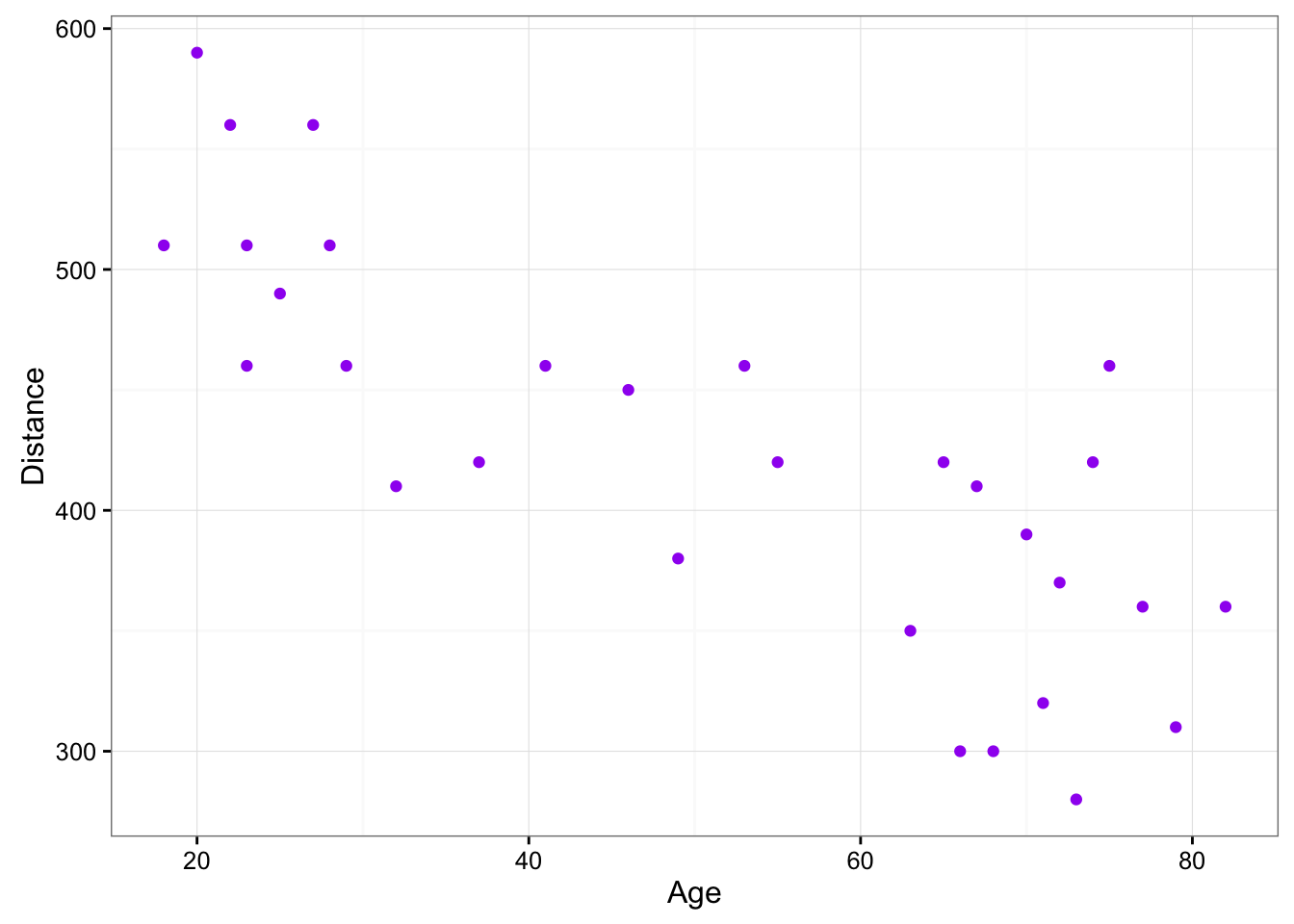
Comment
It is important to mention again that when creating a scatterplot, the explanatory variable should always be plotted on the horizontal \(X\)-axis, and the response variable should be plotted on the vertical \(Y\)-axis. If in a specific example we do not have a clear distinction between explanatory and response variables, each of the variables can be plotted on either axis.